Monday, June 12, 2006
Jungle :: Illustration Friday

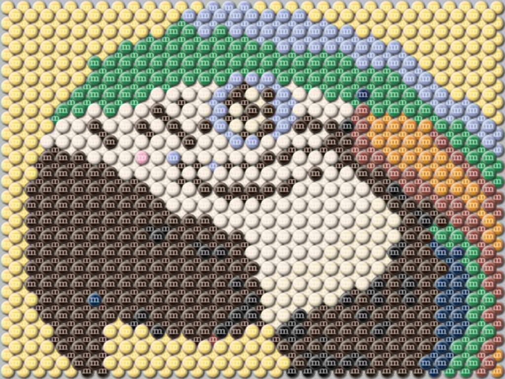
Please click the image for a larger more detailed view. This illustration was created to look like a picture made up of m&m's. When I finished with the first layer, I wasn't happy with the finished image. There was too much border showing. Adding a second offsetting layer finished it.
The colors used match colors available from m&ms.com.
Comments:
<< Home
Hi, thanks for your comment on my jungle post. You've made a cool illustration here. With the offset the M&Ms seem to pop right off the page.
I can't imagine making a real picture of M&Ms, as I would have eaten them long before it was finished. Cool concept.
Post a Comment
<< Home


